class: center, middle, inverse, title-slide # Introduction to ggplot2 ### Kevin Stachelek ### 2019/03/06 (updated: 2019-03-06) --- # Resources .pull-left[ <span style="font-size: 200%">[R for Data Science](https://r4ds.had.co.nz/)</span> <span style="font-size: 200%">[rstudio cheat sheets](https://www.rstudio.com/resources/cheatsheets/)</span> ] .pull-right[  ] --- # Data Science Workflow 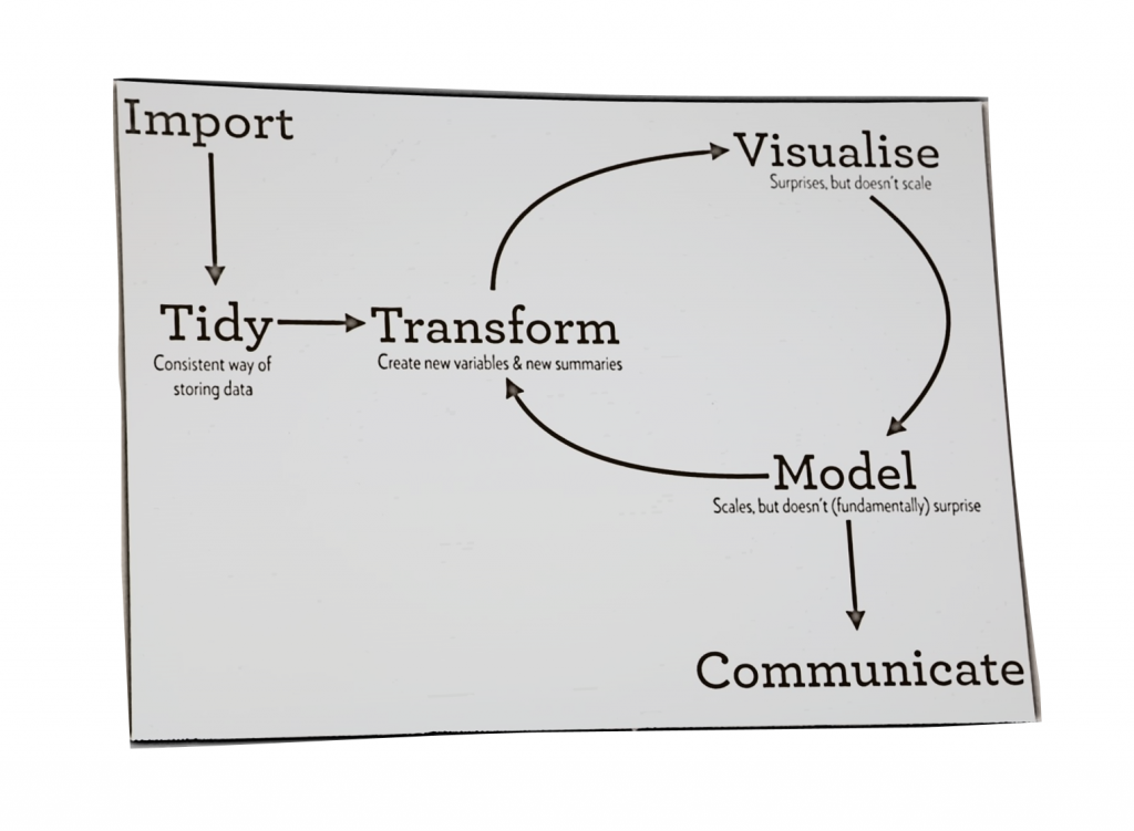 --- # Load Packages ```r library(dplyr) library(ggplot2) library(gapminder) ``` --- # Load Data ```r gm_2007 <- gapminder %>% filter(year == 2007) gm_2007 ``` ``` ## # A tibble: 142 x 6 ## country continent year lifeExp pop gdpPercap ## <fct> <fct> <int> <dbl> <int> <dbl> ## 1 Afghanistan Asia 2007 43.8 31889923 975. ## 2 Albania Europe 2007 76.4 3600523 5937. ## 3 Algeria Africa 2007 72.3 33333216 6223. ## 4 Angola Africa 2007 42.7 12420476 4797. ## 5 Argentina Americas 2007 75.3 40301927 12779. ## 6 Australia Oceania 2007 81.2 20434176 34435. ## 7 Austria Europe 2007 79.8 8199783 36126. ## 8 Bahrain Asia 2007 75.6 708573 29796. ## 9 Bangladesh Asia 2007 64.1 150448339 1391. ## 10 Belgium Europe 2007 79.4 10392226 33693. ## # ... with 132 more rows ``` --- # Relationship between wealth and life expectancy ```r ggplot(gm_2007, aes(x = gdpPercap, y = lifeExp)) + geom_point() ``` 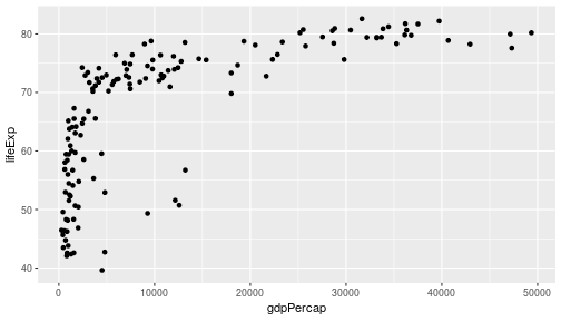<!-- --> --- # Parts of a Plot ```r ggplot(gm_2007, aes(x = gdpPercap, y = lifeExp)) + geom_point() ``` -- * `aes` stand for 'aesthetic'--general term for settings that affect the display of a plot -- * here we specify the x and y axes in the `aes` argument -- * use `+` to add 'layers' to the graph -- * `geom` stands for 'geometric object' -- * `geom_point` means 'make a scatterplot' --- # Using a log scale ```r ggplot(gm_2007, aes(x = gdpPercap, y = lifeExp)) + geom_point() + scale_x_log10() ``` 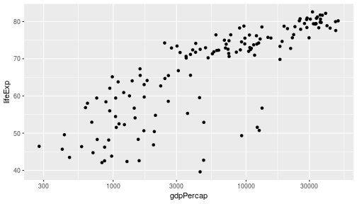<!-- --> --- # Point Color Point Size ```r ggplot(gm_2007, aes(gdpPercap, lifeExp, color = continent)) + geom_point() + scale_x_log10() ``` 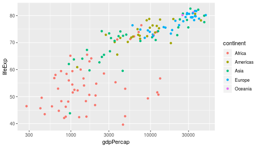<!-- --> --- # Point Size ```r ggplot(gm_2007, aes(gdpPercap, lifeExp, color = continent, size = pop)) + geom_point() + scale_x_log10() ``` 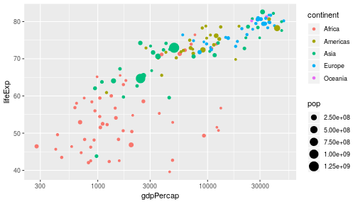<!-- --> --- # Aesthetics |Aesthetic |Variable | |:---------|:---------| |x |gdpPerCap | |y |lifeExp | |color |continent | |size |pop | #### And many more! --- # Facets ```r facet_plot <- ggplot(gm_2007, aes(x = gdpPercap, y = lifeExp)) + geom_point() + scale_x_log10() + facet_wrap(~ continent) print(facet_plot) ``` 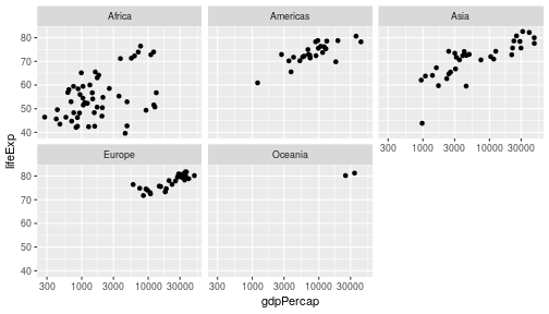<!-- --> --- # How to Print to a File ### Three ways: -- ### ggsave -- ### graphicsdevice -- ### manual --- # ggsave #### ggsave defaults to the last printed plot ```r ggsave("test_facet_plot2.pdf") ``` #### otherwise you can specify a plot object as the second argument ```r ggsave("test_facet_plot2.pdf", plot = facet_plot) ``` --- # graphicsdevice (pdf, png, jpg, etc.) #### *Warning* The plot needs to be *printed*, not just created within the graphics device ```r pdf("test_facet_plot1.pdf") facet_plot dev.off() ``` ``` ## RStudioGD ## 2 ``` --- # Manually ```r # can use the rstudio viewer pane print(facet_plot) ``` <!-- --> --- # Putting it all together in a plot! ```r by_year <- gapminder %>% group_by(year) %>% summarize(totalPop = sum(pop, na.rm = T)) %>% identity() by_year ``` ``` ## # A tibble: 12 x 2 ## year totalPop ## <int> <dbl> ## 1 1952 2406957150 ## 2 1957 2664404580 ## 3 1962 2899782974 ## 4 1967 3217478384 ## 5 1972 3576977158 ## 6 1977 3930045807 ## 7 1982 4289436840 ## 8 1987 4691477418 ## 9 1992 5110710260 ## 10 1997 5515204472 ## 11 2002 5886977579 ## 12 2007 6251013179 ``` --- ```r ggplot(by_year, aes(x = year, y = totalPop)) + geom_point() ``` 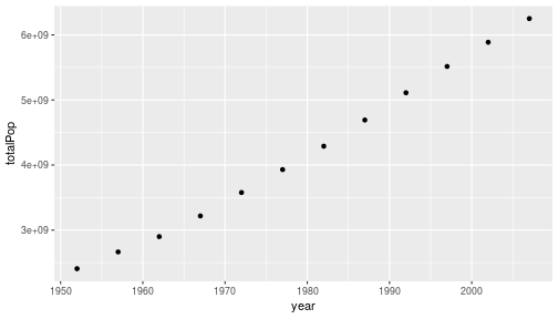<!-- --> --- ```r ggplot(by_year, aes(x = year, y = totalPop)) + geom_point() + expand_limits(y = 0) ``` 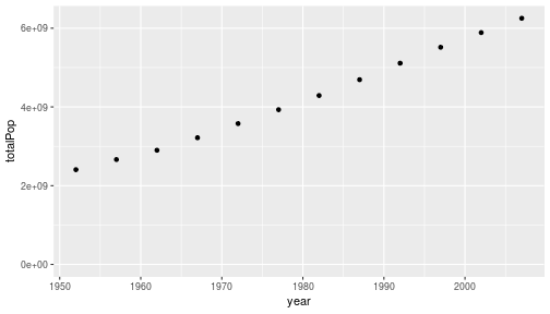<!-- --> --- ```r by_year_continent <- gapminder %>% group_by(year, continent) %>% summarize(totalPop = sum(pop), meanLifeExp = mean(lifeExp)) by_year_continent ``` ``` ## # A tibble: 60 x 4 ## # Groups: year [?] ## year continent totalPop meanLifeExp ## <int> <fct> <int> <dbl> ## 1 1952 Africa 237640501 39.1 ## 2 1952 Americas 345152446 53.3 ## 3 1952 Asia 1395357351 46.3 ## 4 1952 Europe 418120846 64.4 ## 5 1952 Oceania 10686006 69.3 ## 6 1957 Africa 264837738 41.3 ## 7 1957 Americas 386953916 56.0 ## 8 1957 Asia 1562780599 49.3 ## 9 1957 Europe 437890351 66.7 ## 10 1957 Oceania 11941976 70.3 ## # ... with 50 more rows ``` --- ```r ggplot(by_year_continent, aes(x = year, y = totalPop, color = continent)) + geom_point() + expand_limits(y = 0) ``` 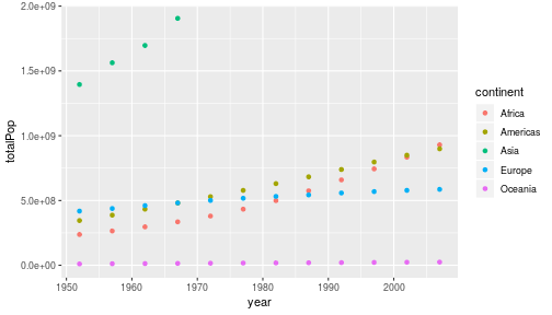<!-- --> --- # Other Types of Plots -- # line plots change over time ```r ggplot(by_year_continent, aes(x = year, y = totalPop, color = continent, height = 3)) + * geom_line() + expand_limits(y = 0) ``` 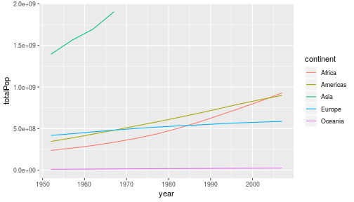<!-- --> --- # bar plots comparing over several categories ```r ggplot(by_continent, aes(x = continent, y = meanLifeExp)) + * geom_col() ``` 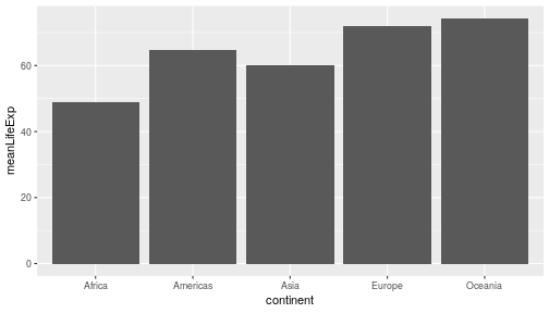<!-- --> --- # histograms distribution of a single numeric variable ```r ggplot(gm_2007, aes(x = lifeExp)) + * geom_histogram() ``` 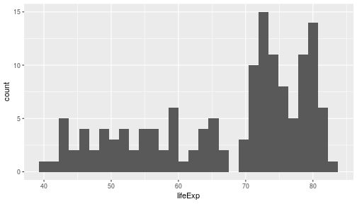<!-- --> --- # It's important to manage the binwidth of a histogram ```r ggplot(gm_2007, aes(x = lifeExp)) + * geom_histogram(binwidth = 5) ``` 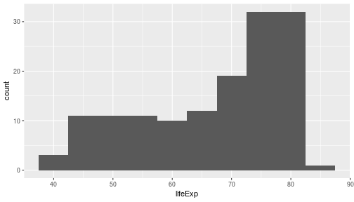<!-- --> --- # box plots distribution of several numeric variables ```r ggplot(gm_2007, aes(x = continent, y = lifeExp)) + * geom_boxplot() ``` <!-- --> --- # Histogram vs Box Plot .pull-left[ ```r ggplot(gm_2007, aes(x = lifeExp)) + * geom_histogram() ``` <!-- --> ] .pull-right[ ```r ggplot(gm_2007, aes(x = continent, y = lifeExp)) + * geom_boxplot() ``` 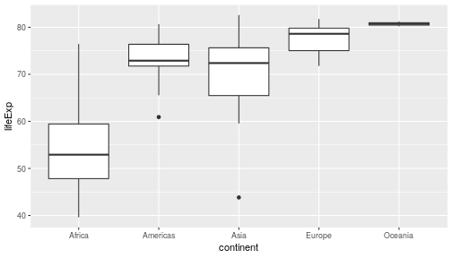<!-- --> ]